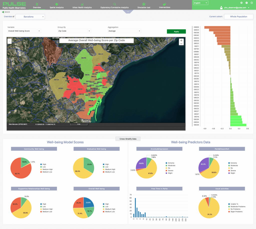
All the geospatial data collected or generated within PULSE are accessible through the WebGIS tool (PWG), a web-based platform that allows the visualization of the data, to monitor different kinds of public health phenomena and to explore their location-related dynamics.
The data collected are geo-referenced and then transformed into maps: detailed public health maps, air pollution and environmental maps are prepared using geo-statistics and multi-spectral satellite images analysis.
Observing maps and historical series allow a better understanding of complex phenomena, showing patterns and trends linked to territorial factors that otherwise would remain hidden. According to this concept, the PULSE WebGIS was developed as an easily configurable tool with implemented some innovative features that allow the user to navigate data in time and space.
The actual system core is constituted by:
- the WebGIS Viewer, that provides visualization access to the geospatial data;
- the WebGIS Configurator, that provides the necessary authoring tools to modify existing maps and change their configuration;
- a Javascript API, designed for integrate the PULSE WebGIS with other PULSE components
The WebGIS Viewer: Side-by-side multi-map navigation & Temporal navigation
The system developed implements some innovative features that allow the user to navigate data in time and space, allowing also non-professional to easily modify any visualization configuration. Among its features, the most relevant ones are:
- a Double-Map functionality allows to simultaneously display, side-by-side, two different maps
- a Time Manager Widget allows to navigate Time-series data simply by moving a cursor on a bar;
The simultaneous use of Time Manager Widget and multi-map navigation allows the user to navigate data in time and space in the two side-by-side maps, thus providing the possibility to intuitively investigate possible correlation and/or cause-effect relationships characterized by a time delay (since the time navigation can be synchronous or asynchronous as per user’s choice). In this way is it possible to detect spatial patterns that otherwise would be difficult to notice (between two different phenomena at the same time or the same phenomenon at two different times).
Examples are shown in the following figures that respectively represent the correlation between asthma hospitalizations and poverty rate in New York City (2016) and how vegetation helps lowering the ground temperature in cities (correlation between land surface temperature and vegetation in summer 2019 in Paris).


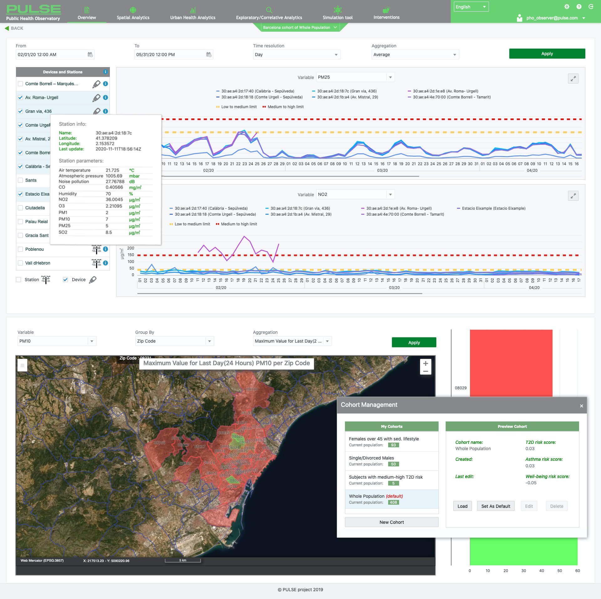
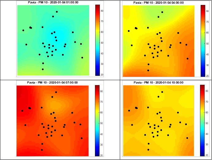
Another important one is the Time Manager, that allows access to long time series of data in a straightforward way supporting aggregation of data on different temporal basis (hourly, daily, monthly).
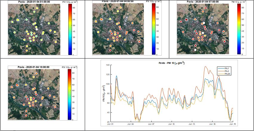
Time Manager can be used to navigate the air quality images produced by satellites, but also the data acquired from the monitoring stations. PWG allows to explore more than 50 million of collected measurements (showing the position of the stations, acquired parameters, values of measurements, charts of the monitored pollutants). As an example, the following figures shows, respectively, the PM25 measurements acquired by PurpleAir sensors in Pavia averaged on an hourly basis (April 3rd 2020 from 1pm to 2pm) and a chart representing the measurement of PM concentration acquired in time by a monitoring station deployed in Pavia (17th April 2019).


The WebGIS Configurator & the Data loading module
Even if PWG is mainly used for visualization and analysis purposes, it also includes a whole set of tools in order to manage and administer the datasets in the system. In particular, it provides the functionalities to manage the entire life-cycle of geographical data (e.g. loading new data, publishing on the cartographic server, etcetera), and the authoring tools to administer the layers. During the project, as these tools were being developed, they were extensively used for the configuration of all the data in the platform (in fact 7 different WebGIS – one for each pilot – were created, each with different layer configurations), and they proved to be really powerful, simplifying the management of the data and some operations that normally in a WebGIS system would have to be performed manually.
These management tools are included in the “Configurator” component, that is the is the actual tool, meant to be used also by non-professionals, that allows to define and customize the WebGIS and to define how it gets displayed by the Viewer.
It is composed of different modules (some of which available to system administrator only), that allow to create and/or configure, in a highly customizable way, the various parts of the WebGIS: data, maps, layers and data-sources. In particular, it is possible to customize the WebGIS of a pilot city, by removing existing layer from the Table of Content, or selecting the new ones to add from the Layer Catalog list (i.e. the list containing all the layers loaded in the system). It is also possible to define the layer organization in groups and relative ordering within the Table of Content (TOC, i.e. the map legend that allows adjusting the layer visualized in the map).
The Configurator also includes the Data Loading Module, that allows the user to add new vector data into the system in a quick and simplified way, automating some steps that otherwise the user would have to perform manually. The current format that Pulse WebGIS supports for automatic loading is the shapefile, since it is a very popular geospatial vector format for GIS software.
API for integration with other PULSE components & Technical information
In order to allow maximum flexibility and adaptability to stakeholder’s needs, the whole WebGIS was realized using technologies based on Open Source software (Java and Tomcat for the back end, JS and OpenLayers for the front end, Geoserver mapping server, DBMS PostgreSQL / PostGIS, etc.).
The main role of WebGIS in the PULSE architecture is to provide access and visualization to geo-data, but it also provides geospatial services to the other components of the system. The Pulse WebGIS has thus been designed to be used both as a standalone application and also as an integrable component that can be included or embedded in external applications.
To be able to support the various request types from heterogeneous applications, different communication interfaces and protocols have been implemented. The WebGIS supports the standard OGC protocols, and also uses various custom Web-services to communicate with the Pulse components. Moreover, a Javascript API was designed and implemented to be used when the Viewer needs to be embedded in an external Web Application; the API allows this external application to interact directly with some of the functionalities of the Viewer.
The API has been designed to be used primarily by the PULSE Dashboard, but, being generic, it allows the WebGIS Viewer to be integrated in any other external application, provided that the Viewer is included in an iframe (e.g. a standard HTML component).
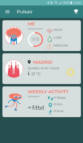
The app has been developed to foster a healthy lifestyle and to make people more aware about the air pollution in the city. The app can be connected to FitBit, Garmin and Asus health tracker devices; the citizens can provide subjective data (from app questionnaires), physiological and activity data (from the wearable sensors) and localization data.
specific behavioral modifications that are delivered through a specific logic of supportive feedbacks.
Furthermore, the app can show to the user the exposure to the air pollutants by combining the information of the position (the GPS data) with the data coming from the environmental sensors that measure air pollutants (e.g. PM 2.5, CO, etc).
By using Pulseair, the citizen can also support the local public health planning because the shared data help the public health institutions to assess neighborhoods and understand the health needs of the population.
Pulsair app gathers personal and environmental data to carry out a risk assessment for citizens is available for the 2 most widely used mobile platforms currently, Android and iOS. The app can be downloaded through the official app store of both platforms, Play Store and Apple Store.
The development of Pulsair has been planned in three main iterations. The first iteration contained the basic elements for data acquisition such as questionnaires including the risk assessment questionnaires, as well as synchronization with Fitbit devices for the acquisition of physical activity data and included educational content on health and air quality, and feedback after questionnaires. The next iteration in the development of PulsAir consisted of the first version of the type 2 diabetes and asthma risk models where users will be able to observe the results of these models according to the information provided. It also began to obtain data on the position of users (GPS) to produce models of exposure to air pollution and thus be able to provide, in future iterations, suggestions on routes for less exposure. The latest iteration produces a complete and improved application that includes, not only risk models, health content according to the continuous evaluation that will be made to the application in the previous iterations, but also the inclusion of new tracking devices, Garmin and Asus, along with the inclusion of a remote notification service that provides a tool for PHOs to improve the user experience and the content showed on the app. The application has been developed using a hybrid mobile development platform, Ionic ( https://ionicframework.com/), to reduce development times since it allows with a single development in a single programming language, in this case based on Angular, to build applications for both platforms, although that implies losing some of the native development features or having some problems controlling specific elements of each of the platforms for which PULSE app is available.
The design of an intervention on the urban environment can be a challenging operation, as the times and costs involved are significant and it can be difficult to identify the variables that need to be controlled in order to improve the public health panorama of the city.
To this end, a tool that allows to simulate the effects of possible variations in the environmental or socioeconomic situation can be particularly helpful.
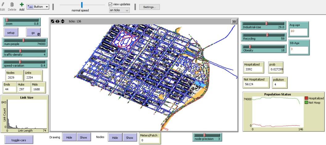
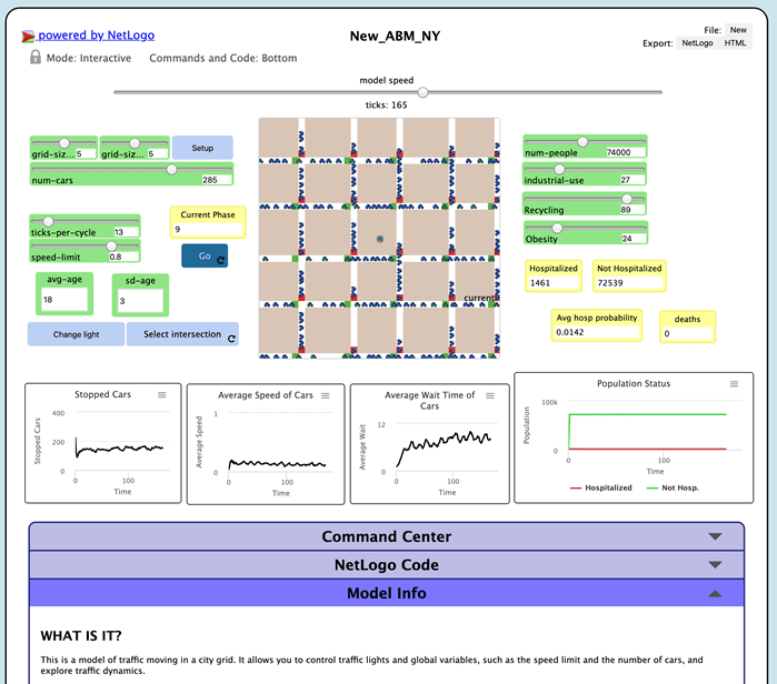
The PULSE dashboard features a set of simulation tools developed using the Agent-based modelling (ABM) technique. These models are dynamic tools that simulate the actions and interactions of entities named agents, i.e. autonomous elements that possess a peculiar behaviour and interact with each other and with the environment they are immersed in. Agents can represent many kinds of real-life entities (people, animals, vehicles, bacteria etc.), therefore ABMs are very versatile and used in a lot of research fields.
Two prototypes of simulation tools have been developed within PULSE, all based on real data gathered during the project:
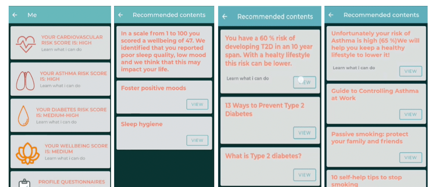
- A tool for the simulation of asthma-related hospitalizations in East Harlem (New York) as a consequence of the variations of air pollution, demographic and socioeconomic factors such as age of the inhabitants, the percentage of land used for industrial purposes, the obesity rate and the garbage recycling rate. All these variables are used as covariates in a geographically weighted linear regression model that has been designed and tested in a parallel study performed on New York City data and published on the journal Frontiers in Medicine. Figure 1 shows the interface of this model.
- A tool for the simulation of asthma-related hospitalizations as the one presented above, with the addition of simple traffic control dynamics, such as traffic light regulation and traffic jams supervision (Figure 2).
In modern cities, air quality monitoring is a crucial activity, since urban environments are characterized by millions of people living in a confined space, where air pollution can cause several, often life-threatening, diseases.
One of the hottest topic in Exposomics (the study of the connection between health and the factors people are exposed to, apart from genetics) is the influence of air quality on individual health.
In PULSE, an innovative calculator was developed, that is based on:
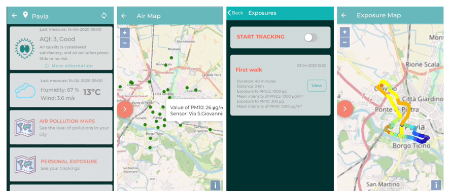
- dense and frequent air quality monitoring; dense networks of low-cost sensors were used to acquire suitable data;
- a methodology to track movements of people. In PULSE, smartphones expliting their inner GNSS sensor and, possibly, accelerometers were used; the phones were equipped with a purpose developped App.
Foe each path recorded, it is possible to determine the exposure to all the monitored pollutants.
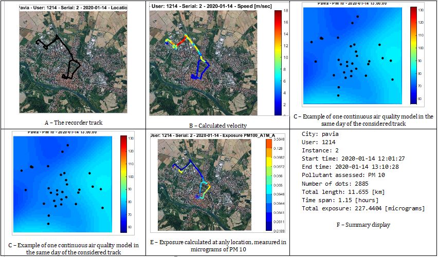
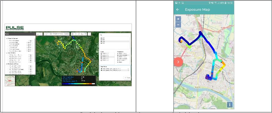
Results can be shown in a WebGIS environment or in the App used to track the path.
- IoT-sensory data from mobile and wearable devices (wristbands, smartwatches), and from environmental monitoring devices, and
- computed results of the PULSE asthma & T2D risk models, well-being and personal pollution exposure model
In modern cities, air quality monitoring is a crucial activity, since urban environments are characterized by millions of people living in a confined space, where air pollution can cause several, often life-threatening, diseases.
Within the PULSE project, dense networks of low-cost sensors have been deployed and tested. Such technology is under a rapid development and presents several strengths.
It was decided to test three sensors: PurpleAir PA-II sensor (measuring PM 10, PM 2.5, PM 1.0, temperature, pressure and humidity), the DV800 sensor (measuring, in its full configuration, as it is modular, PM 10.0, PM 2.5, PM 1.0, C0, CO2, NO, NO2, O3, noise, temperature, pressure and humidity) of DunavNet company; iAeris from ASUS (measuring PM 10, temperature, pressure and humidity). They are shown in Figure 5.
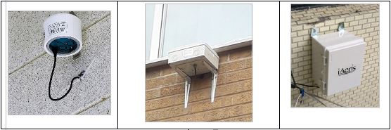
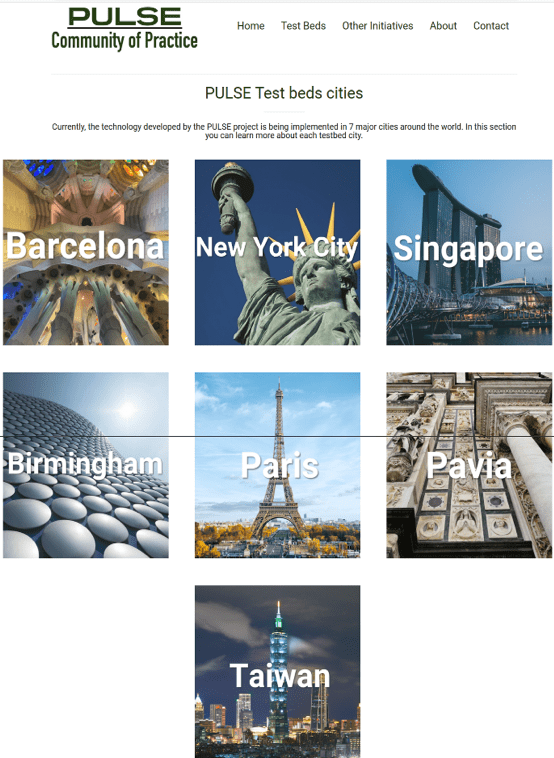
The PULSE project has had 7 pilots: Barcelona (ES), Birmingham (UK), New York (USA), Paris (FR), Singapore (SG), Pavia (IT) and Kee-Lung (TW). All the pilots deployed some sensor; in the following, some results from Pavia are shown.
PHO Observatory System APIs
The comprehensive service layer middleware of PHO Observatory System APIs is the modular scalable core of the complete integrated PULSE platform, ensuring the main back-end functionalities of:
- data acquisition from heterogeneous sources and M2M exchange,
- data integration, fusion, and consolidation
- analytics processing pipelines, including integration and execution management of all the PULSE models described further below,
- and transformation and preparation of the data to optimally serve and relay them for interactive visualization and presentation to the PULSE end-user applications and controls (like the PulsAIR mobile app. or PHO Observatory Dashboards…),
thereby providing the underlying full platform support not only to the PHO Observatory installations but also to PulsAIR app. and partially to the WebGIS and all other PULSE end-user applications and tools.
It is also the modularity and scalability backbone of the PHO Observatory System and PULSE platform and its services provision on the range of targeted installation types and sizes – PaaS, AaaS or SaaS, packaged Observatory installation for relevant PHOs or preventive health authorities of a single Smart City or Community, or standalone tools like the PHO Observatory Dashboards or just the IoT sensing and data fusion middleware. With the HiAP features support, the installation can also be adapted and targeted to organizations engaged in other urban policy areas (social care, elderly/geriatric care, epidemiological, environmental…), mainly leveraging the flexibility of this API services layer and the underlying Unified Data Store.
These main integrative middleware and back-end services have been implemented on heavy-duty industry-standard and proven Enterprise Java web technology stack, with Spring and Spring Boot scaffold framework features (native Hibernate ORM, Jersey for REST services, Security…), and running on Oracle GlassFish application server.
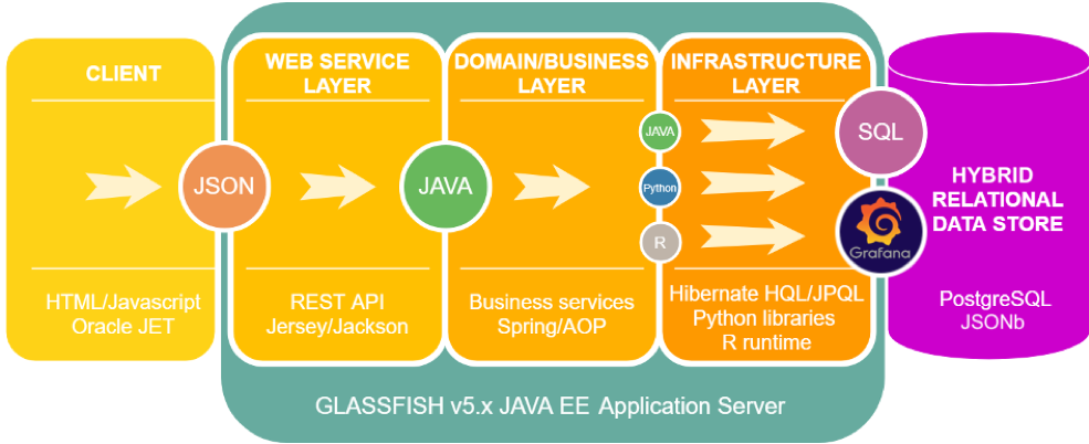
T2D and Asthma prediction models and well-being/resilience models have been implemented as a set of Python and R functions, running on parallel servers or process threads, and interfaced with core Java methods, additionally supporting what will likely remail the most commonly and widely used languages in analytics and data science in the next several years. Additionally, Grafana with its native useful features and performance advantage in native data manipulation has been leveraged where viable in interaction and fetching methods supporting large datasets (~million records) on UI controls (zooming in/out and changing the accuracy of dashboards with adaptive data loading, logs visualization and exploring).
The personal exposure tool is based on advanced algorithms. First of all, spatio-temporal interpolation, in order to determine continuous models from spot measurements.
Moreover, it is necessary to process GNSS data in order to determine instantaneous velocities. Figure 8 illustrates the process. The data originally recorded by the App are shown in tabular form; some additional columns are also shown whose figures were obtained by calculation: instantaneous speed and the distance between one dot and the following one. The pure trajectory are the shown in geographic terms and, in the end, they are coloured based on velocity.
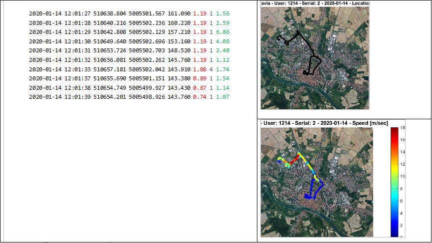
Finally, a breathing model is needed to estimate the air volume inhaled at each breathing act.
Results are coming soon
Results are coming soon
Results are coming soon
The project’s pilot sites were engaged in enhancing the Quality of Life of their citizens through different initiatives, at a neighborhood, city or national level, such as the 10,000 steps challenge, the initiative on Health, Well-being and Environment and other local initiatives to study the impact of urbanization in the air pollution and physical inactivity. Partners and beneficiaries were therefore running environmental initiatives, local community programs (grassroots, community programs, neighborhoods’ local actions), national level deployments programs and urban implementations activities.


The pilots have deployed different devices and tools for data collection and leveraged on existing air quality stations. These data have been used to feed the different models and tools developed by the project (the health risk model, the personal exposer model, the wellbeing model and life style model, The pulsAir mobile application and the PHO exploratory Dashboards.


The following table summarizes the used devices and the collected data:

The Big Data to Policy Course is intended for urban policy makers and practitioners, representatives of community initiatives and organizations, and anybody interested in big data applications for smart, healthier, and sustainable cities. Divided in 13 modules, this course is designed to meet the needs of people without significant expertise or training in data science; however, it also provides the opportunity for more advanced learners to further their knowledge and skills.
This first course is part of the PULSE learning platform, a solid academic platform implemented to provide teachers and students with the necessary tools to have the best experience within the courses. The following table summarizes the PULSE Big Data to Policy Digital Course.
This course is divided into the following modules
- Introduction
- Public Health: challenges for the cities
- Social determinants of Health
- Health in All Policies
- Inclusive Smart Cities
- Big Data approach and opportunities for the society
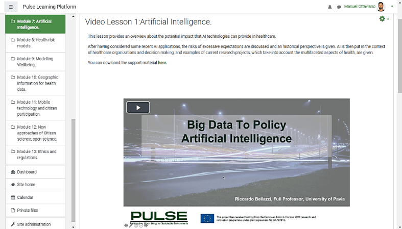
- Artificial Intelligence
- Health risk models
- Modelling Wellbeing
- Geographic information for health data
- Mobile technology and citizen participation
- How interactive visualizations of Big Data can better inform environmental Policy
- Ethics and regulations
Pulse has been developed using Moodle platform a popular Learning Management System.
Participants will work through the course on an individual basis and will be assessed via completion of comprehension and knowledge quiz at the end of each class.
Results are coming soon
A Community of Practice (CoP) is a learning platform designed to be used by a group of people to share and learn from one another about a certain topic area. More specifically, CoPs intend to create opportunities for the population, localities, and other stakeholders to provide feedback, data, and information as well as to share lessons learned, best practices, and case studies.
The PULSE Project’s CoP, in particular, is a collaborative and informative web platform that includes knowledge and experiences acquired from the pilot users in the seven testbed cities. With this information, the PULSE CoP aims to create opportunities for citizens, municipalities and other stakeholders to upload data, provide feedback, disseminate information, exchange best practices and examples of research, and share use cases within the knowledge areas of the project. The public page showcases the experience of the PULSE test beds, a description of the pilot, an overview of the participants and other city initiatives, and the recommended media channels in order to follow the city’s activities related to health promotion.
The PULSE Project’s CoP has been used by each of the seven test beds to share with and learn from one another; in this section, we offer examples of the ways in which the testbeds utilized the CoP platform.
The PULSE CoP has been conceived as a collaborative tool and, since its design, has maintained that philosophy. For this reason, an iterative and Co-design methodology was applied for conceptualization. The seven test beds of the project collaborated on the definition of structure and contents that can be grouped as follow:
- Pilot description: A brief summary of the city pilot, and the goals that each city vision of the implementation of the PULSE project solution in their city.
- Pilot Statistics: this section seeks to acquire the most relevant information regarding each pilot. This information includes: 1) Number of users recruited; 2) Gender balance within the recruitment; 3) Age of participants; 4) Any other relevant information considered by the testbed city.
- Recruitment process description: The section details different techniques applied in each city to recruit participants, taking into consideration the characteristics of each city.
- Pilot images: workshop activities, recruitments, among others.
- Pilot videos: including users testimonials to share their experiences within the project.
- Other City initiatives: that promotes health, events, awareness within the scope of the project.
- Best practice and lessons: learned during the test bed implementation.
- Relevant City Social network accounts
Link : http://observatory.lst.tfo.upm.es/wordpress/